
MAP
mapping is an important item in the progressive and attractive training program for Scouts/Guides, Rover and Rangers. Maps provide an efficient and unique means for reading and understanding the earth.
The earth has a surface area of 197 million sq. miles pitted and roughened by mountains, plains and seas. The highest mountain is under miles. this is less than 0.1 percent of the earths. The deepest part of the ocean is not much deeper that Mt. Everest. Mt.Everest is 29,028 feet high and Marians Trench 35,958 feet deep are only bump a dent in the earth’s circumference. Two fifths of its island and three fifths of the earth is covered with water and all the world continents would fit into an area the size or the Pacific Ocean.
To understand the concept of Mapping, we must know what is Map and how to read it.
A map is a pictorial representation of the earth’s surface as looked from above, on a flat surface drawn to scale.
Maps are many and varied, but all are basically the same. They give a simplified plan or bird’s eye view of some part of the earth’s surface arge or small. The range forms those showing the entire word to those giving the dimensions of a house and garden. Where large area is represented, the amount of details given will be less.
- Primitive man moving about constantly in search of food and shelter restored to some method of recording his surrounding and used symbology to depict various features relevant to him. This resulted in the idea of map and the symbols or means of expression.
- Map is a tool of communication contains wealth of information with varieties of details.
- Map contains very valuable and vast variety of information.
- Map is a document to satisfy the diverse needs of specialists in many disciplines planners, Administrators, Engineers, Architects, Industrialist…
- Map is prepared for each purpose separately… Political, Physical, Revenue, Roads, Rivers, Irrigation, Population, Industries, Antiques, Defense, Tourist, etc. Thematic Maps.
- Map contains Title, Scale, Orientation, Conventional Signs, Contour System, Date of issue/revision, How made, Made by whom, Grid lines…
A map is a flat, two-dimensional representation of an area. Usually maps present a view from above. Normally the space they represent is a geographic area (cities, towns, countries or neighborhoods, for example), but maps can in theory represent non-geographical things (a “map” of the circulatory system) or even things with no physical reality at all (a “map” of someone’s consciousness).
A globe is a three-dimensional map of the earth over layer on a sphere. Other differences include the fact that any large map, being an attempt to display part of the surface of a sphere (the earth) on a flat sheet of paper, is always distorted to some degree, while a globe is not.
WHAT DOES A MAP TELL
- DESCRIPTION: Names of Area, Location, Date.
- DETAILS: Map Symbols, Map – made features, Water features, Vegetation features, Elevation features.
- DIRECTION: North (True, Magnetic)finding by day and night. Orientation – Declination, Year, Bearings – FORWARD & BACKWARD BEARING.
- DISTANCE: Proportion – Land Measure to Map Measure. Scale – Statement, Plain Scale, Representative Factor.
- DESIGNATIONS: Name of places.
OTHER INFORMATION (MARGINAL INFORMATION )
Helpful in map reading, remember all makings have meanings Do not add any
Dot or line of your own on the map.
THE ROLE OF COLORS ON MAPS
By Matt Rosenberg
Cartographers utilize color on a map to represent certain features. Color use is often consistent across different types of maps by different cartographers or publishers. Map colors are (or should be, for a professional looking map) always consistent on a single map.
Many colors used on maps have a relationship to the object or feature on the ground. For example, blue is almost always the color chosen for fresh water or ocean (bust blue may not just represent water).
Political maps, which show more human created features (especially boundaries), usually use more map colors than physical maps, which represent the landscape often without regard for human modification.
Political maps will often use four or more colors to represent different countries or internal divisions of countries (such as states). Political maps will also use such colors as blue for water and black and/or red for cities, roads, and railways. Political maps will also often use black to show boundaries, differing the type of dashes and/or dots used in the line to represent the type of boundary – international, state, or county or other political subdivision.
Physical maps commonly use color most dramatically to show changes in elevation. A palette of greens is often used to display common elevations. Dark green usually represents low-lying land with lighter shades of green used for higher elevations. In the higher elevations, physical maps will often use a palette of light brown to dark brown to show higher elevations. Such maps will commonly use reds or white or purples to represent the highest elevations on the map.
With such a map that uses shades of greens, browns, and the like, it is very important to remember that the color does not represent the ground cover. For example, just because the Mojave Desert is shown in green due to the low elevation, it doesn’t mean that the desert is lush with green crops. Likewise, the peaks of mountains shown in white does not indicate that the mountains are capped in ice and snow all year long.
On physical maps, blues are used for water, with darker blues used for the deepest water and lighter blues used for more shallow water. For elevations below sea level, a green-grey or red or blue-grey or some other color is used.
Road maps and other general use maps are often a jumble of color. They use map colors in a variety of ways…
- Blue – lakes, rivers, streams, oceans, reservoirs, highways, local borders
- Red – major highways, roads, urban areas, airports, special interest sites, military sites, place names, buildings, borders
- Yellow – built-up or urban areas
- Green – parks, golf courses, reservations, forest, orchards, highways
- Brown – deserts, historical sites, national parks, military reservations or bases, contour (elevation) lines
- Black – roads, railroads, highways, bridges, place names, buildings, borders
- Purple – highways, (also used on U.S.G.S. topographic maps to represent features added to the map since the original survey)
SCALE
https://www.youtube.com/embed/kuplWP380oM?wmode=opaqueMeasuring Distances on a Map: Map Scale
By Matt Rosenberg
A map represents a portion of the earth’s surface. Since an accurate map represents the land, each map has a “scale” which indicates the relationship between a certain distance on the map and the distance on the ground. The map scale is usually located in the legend box of a map, which explains the symbols and provides other important information about the map. A map scale can be printed in a variety of ways.
A ratio or representative fraction (RF) indicates how many units on the earth’s surface is equal to one unit on the map. It can be expressed as 1/100,000 or 1:100,000. In this example, one centimeter on the map equals 100,000 centimeters (1 kilometer) on the earth. It also means that one inch on the map is equal to 100,000 inches on the land (8,333 feet, 4 inches or about 1.6 miles). Or even 1 paperclip on the map is equal to 100,000 paperclips on the ground. Other common RFs include 1:63,360 (1 inch to 1 mile) and 1:1,000,000 (1 cm to 10 km).
A word statement gives a written description of map distance, such as “One centimeter equals one kilometer” or “One centimeter equals ten kilometers.” Obviously, the first map would show much more detail than the second because one centimeter on the first map covers a much smaller area then on the second map.
The first two methods of indicating map distance would be ineffective if the map is reproduced by a method such as photocopying and the size of the map is modified. If this occurs, and one attempts to measure an inch on the modified map, it’s not the same as an inch on the original map.
A graphic scale does solve this problem because it is simply a line marked with distance on the ground which the map user can use along with a ruler to determine scale on the map. In the U.S., a graphic scale often includes both metric and U.S. common units. As long as the size of the graphic scale is changed along with the map, it will be accurate.
Maps are often known as large scale or small scale. A large scale map refers to one which shows greater detail because the representative fraction (e.g. 1/25,000) is a larger fraction than a small scale map which would have an RF of 1/250,000 to 1/7,500,000. Large scale maps will have a RF of 1:50,000 or greater (i.e. 1:10,000). Those between 1:50,000 to 1:250,000 are maps with an intermediate scale. Maps of the world which fit on two 8 1/2 by 11 inch pages are very small scale, about 1 to 100 million.
scalescale, in cartography, the ratio of the distance between two points on a map to the real distance between the two corresponding points portrayed. The scale may be expressed in three ways: numerically, as a ratio or a fraction, e.g., 1:100,000 or 1/100,000; verbally, e.g., “one inch to one mile” (not “one inch equals one mile”); and graphically, by marking distances on a sample line. The last method has the advantage that the scale remains true even if the map is enlarged or reduced mechanically. The first method is particularly useful since any unit of measurement may be used; e.g., if one uses metric units, a scale of 1:100,000 would mean that one centimeter on the map represents one kilometer on the earth’s surface (since 100,000 centimeters equals one kilometer). The more the size of features on the map approaches the features’ actual size on the earth’s surface, the larger the scale of the map is said to be. A large-scale map usually shows more detail than does a small-scale map, but covers a smaller area than does a small-scale map of the same size.
MAP SCALES & UNITS
This handout was designed to help you understand the relationships between different map scales, map units, distance, and area. You should understand the logic behind how these are used and how they should appear on real topographic maps. On your upcoming lab exam, you should also be able to convert one type of map scale into another, and calculate size differences (scale factor, area factor) between different maps.
A. Review of Common Types of Map Scales
All map scales are an expression of the numerical relationship between the MAP and the LAND that is represented. The MAP unit is always mentioned first.
1. Verbal Scale: The verbal scale is just a sentence stating that “1 Map Unit = X Land Units”.For reasons of convenience, a mixture of units is commonly used, such as
1 inch = 1 mile
However, there are NO requirements that the units must be different! The expression “1 inch = 63,360 inches” is still a verbal scale. A mixture of map and land units makes the verbal scale difficult to compare between different maps – it must be converted first to a Representative Fraction (see below).
2. Representative Fraction (R.F.): An R.F. scale is a ratio, or fraction, that expresses the mathematical relationship between MAP and LAND, such as
1 : 24,000
which means “1 map unit is equivalent to 24,000 land units.” Because an R.F. carries no units (inches, centimeters, etc.), it means that the R.F. scales can be compared between different maps. Converting an R.F. scale to a verbal scale is very easy; simply select ONE unit and apply it to BOTH map and land numbers. The above example can be written as a verbal scale as “1 inch = 24,000 inches” or “1 meter = 24,000 meters,” etc. (Note: YOU CANNOT MIX UNITS in an R.F.! Doing so will change the numerical relationship of the R.F.)
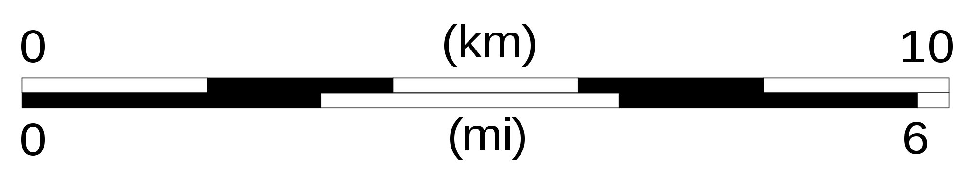
3. Graphic Scale: The graphic scale is a bar chart or “ruler” that is drawn at the bottom of a topographic map. This is the scale that you should use when asked to measure distances on the map. Be Careful: Note that the zero mark is not located at the left end of the graphic scale. For your convenience, the graphic scale extends to the left of the zero mark to indicate fractions of units, such as 1/10 of a mile. You may measure distances by marking off the 2 end points on the edge of a sheet of paper and aligning the edge of the paper against the graphic scale (make sure one of your marks is on the zero).
CONVENTIONAL SIGNS
The various features shown on a map are represented by conventional signs or symbols. For example, colors can be used to indicate a classification of roads. These signs are usually explained in the margin of the map, or on a separately published characteristic sheet
A map is a birds eye view of a piece of land draw on a mangerbal piece of paper only accret to the day it was printed., almost everything that appears on a map, except a written name, is a conventional sign.
Conventional signs are designed to enable the maximum amount of information to be put on a map in the clearest way possible.
Why are symbolsused in maps?
Because there’s not enough room to print the words of the items represented by the symbols.
For simplicity and due to space constraints. It makes the map easier to understand. In addition, if full names of features were to be used on maps, it would be too messy to read.
Since a map is a reduced representation of the real world, map symbols are used to represent real objects. Without symbols, we wouldn’t have maps.
Both shapes and colors can be used for symbols on maps. A small circle may mean a point of interest, with a brown circle meaning recreation, red circle meaning services, and green circle meaning rest stop. Colors may cover larger areas of a map, such as green representing forested land and blue representing waterways.
To ensure that a person can correctly read a map, a Map Legend is a key to all the symbols used on a map. It is like a dictionary so you can understand the meaning of what the map represents.

MAP READING
Maps are the basic tools of geography. They enable us to depict spatial phenomenon on paper. There are conventions used in cartography which allow a map to be read efficiently and quickly.
A good map will have a legend or key which will show the user what different symbols mean. For instance, a square with a flag on top usually represents a school and roads are represented by a variety of widths and combinations of lines. Often a dashed line represents a border. Note, however, that map symbols used in the United States are often used for different things in other countries. The symbol for a secondary highway on a USGS Topographic map is equivalent to a railroad in Switzerland. Make sure to read the legend and you’ll understand the symbols.
Every map is a representation of a larger portion of the earth. Read the feature about scale to learn more about how to determine the distance on earth represented on the map.
Without a north arrow, it is difficult to determine the orientation of a map. With a north arrow (pointing in the correct direction), a user can determine direction. Some maps, such as topographic maps, will point to “true north” (the north pole) and to magnetic north (where your compass points, to northern Canada). Usually, you won’t see something quite as detailed as a compass rose but a map does need to provide orientation.
A neatline is the border of a map. It helps to define the edge of the map area and obviously keeps things looking “neat.”
Since the map is a flat representation of the curved surface of the earth, all maps are inherently inaccurate. There are a variety of projections which have been formulated for different uses.
A map’s title provides important clues about the cartographer’s intentions and goals. You can hope to expect entirely different information on a map titled “Unemployment in Jefferson County” versus “Topography of Mount St. Helens.”
Color appears so often on maps that we often take it for granted that mountains are brown and rivers are blue. Just as there are many types of color maps, there are also many differentcolor schemes used by cartographers. The map user should look to the legend for an explanation of colors on a map.
Our expectations of colors on a map leads to some problems when it is used for elevation. Elevation is often represented as a sequence of dark greens (low elevation or even below sea level) to browns (hills) to white or gray (highest elevation). Since many people associate green with a fertile region, many map users will see lower elevations, which may be deserts, and assume those areas are filled with lush vegetation. Also, people may see the reds and browns of mountains and assume that they are barren, Grand Canyon-type landscapes of desolation but the mountains may be forested and covered in brush.
Additionally, as water always appears bright blue on a map, the user is often inclined to visualize any water on a map as pristine and clear blue – even though it might be entirely different color due to pollution.
